Welcome to Womanhood Design Series
For my core 3 studio class in fall 2026, we had to make a series throughout the entire semester. We got assigned a random bookshelf at the beginning and had to do research based on that shelf. Mine was on old houses compared to modern homes. At first I had no idea what to do with that. But after talking with my teacher, we decided to pursue “Tradwife,” as in traditional wife. Which lead to my feminist choice on womanhood and things woman have to deal with. From there, every project had to relate to the topic but could branch off it. I started off with typical household stereotypes for women and in my publication I went into the darkness/reality of what women deal with when it comes to the public and men. Each project resembles my overall theme, which was very nice to see be put together at the end.
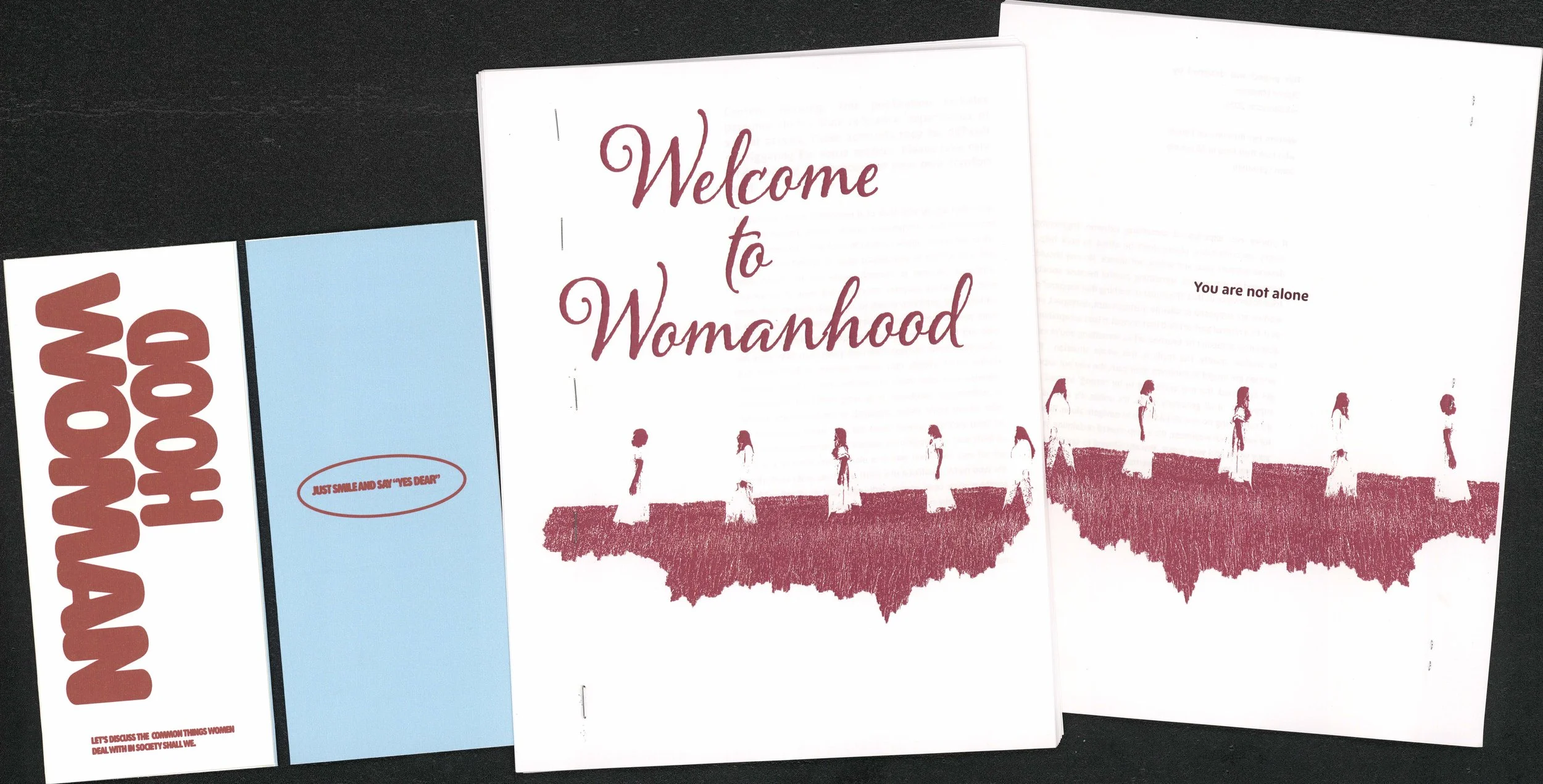
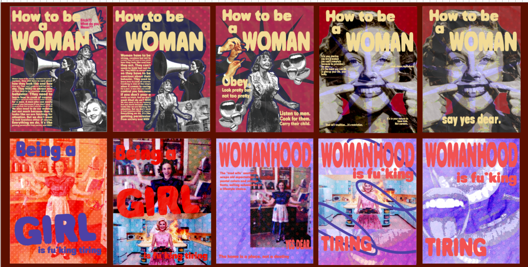
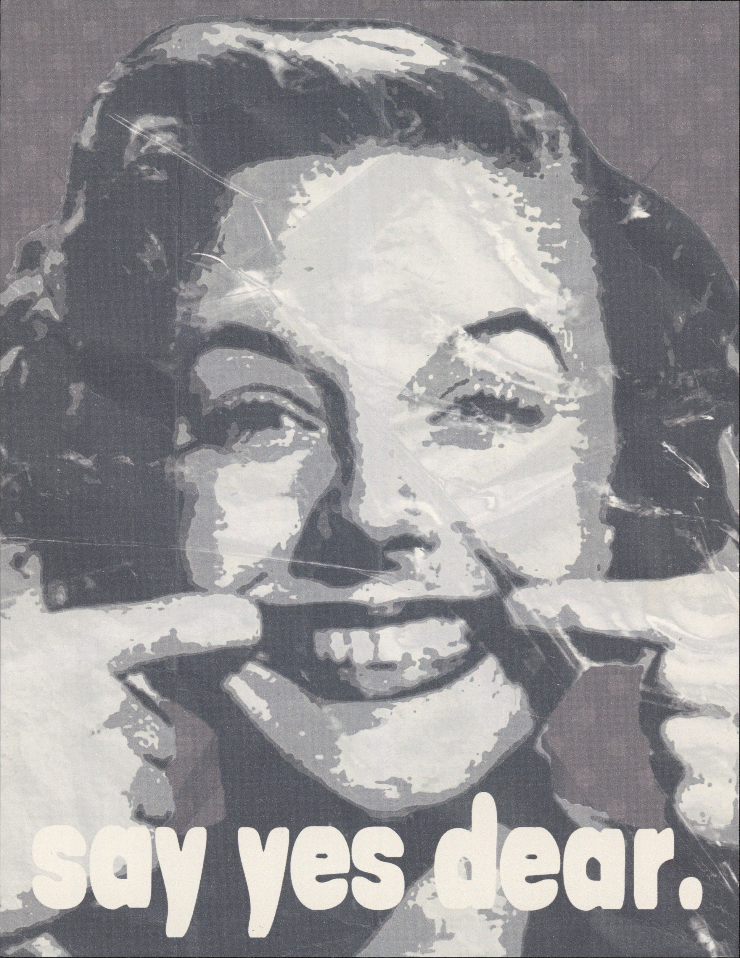
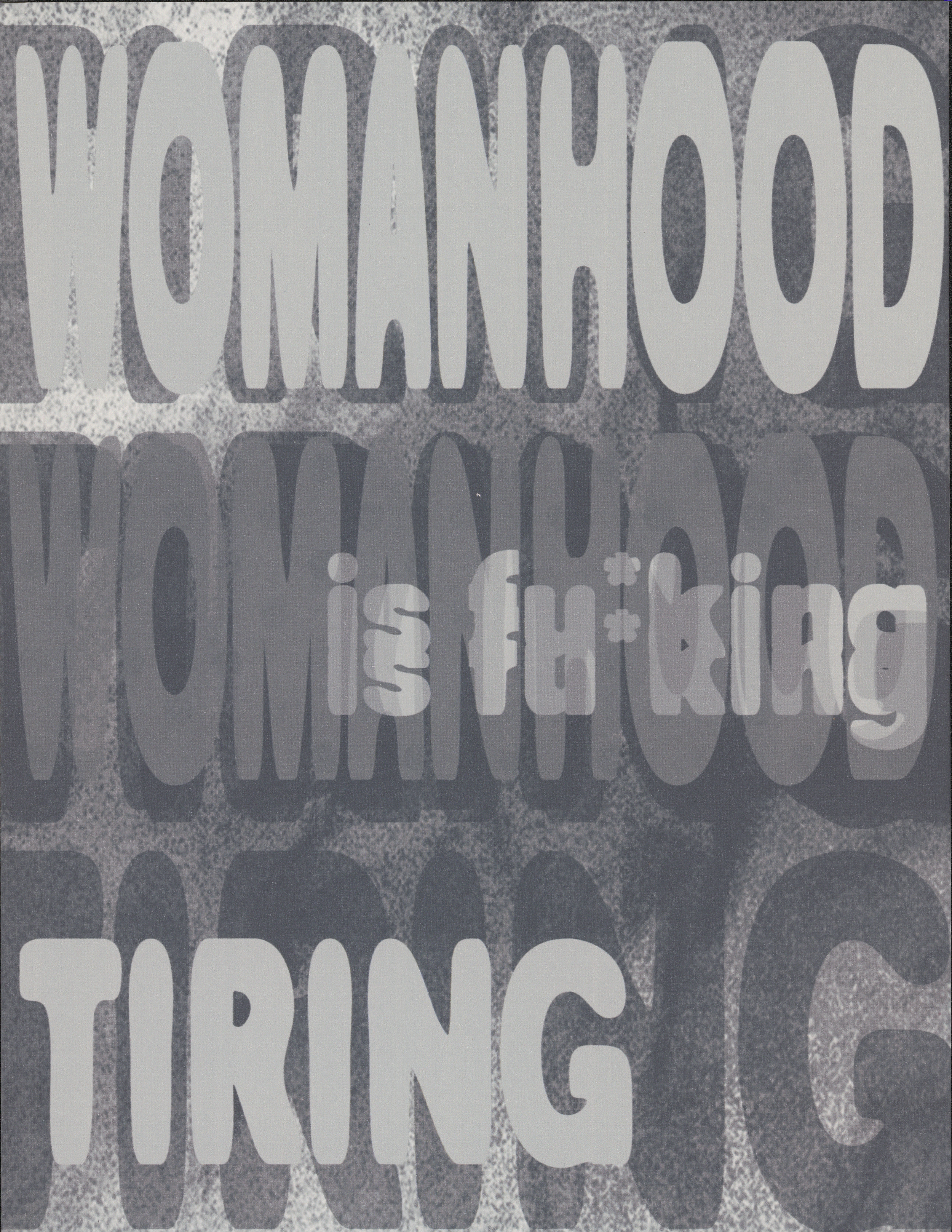
For the first project we had to make a flyer to introduce our theme of our series. We had to go two completely different, separate ways and make 5 iterations for each paths. In total we had 10. This was the start of our theme. After making our 10 iterations, we did a quick crit and with the feedback, we came up for a final version for both paths. We had to make them into black and white. After my feedback, I made the first path simpler since the girl in the flyer said it all. As for the second path I made it more overlapping, but without images because with all the type, it was necessary.
Project 1:
Project 2:
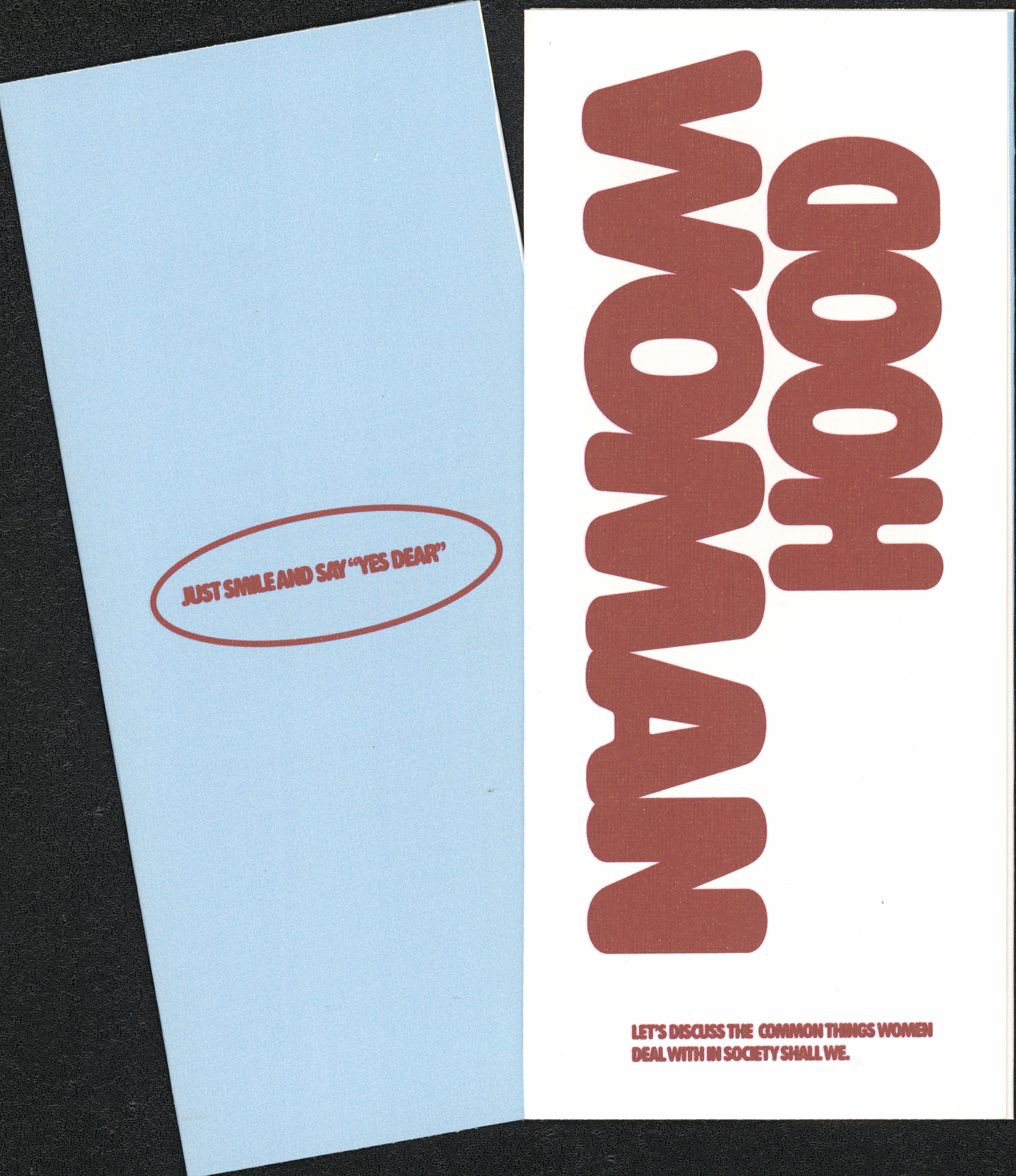
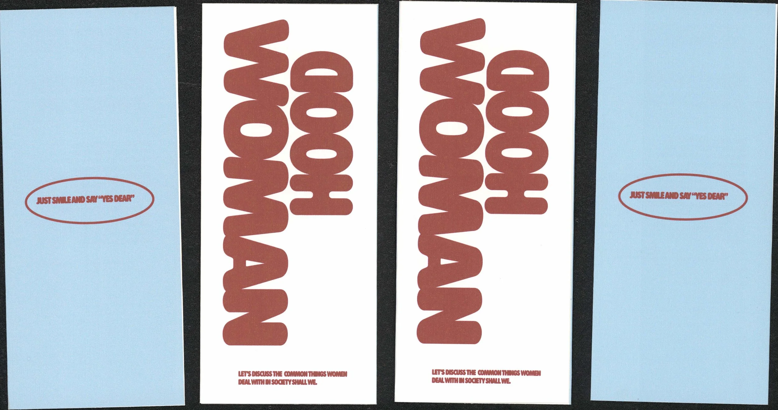
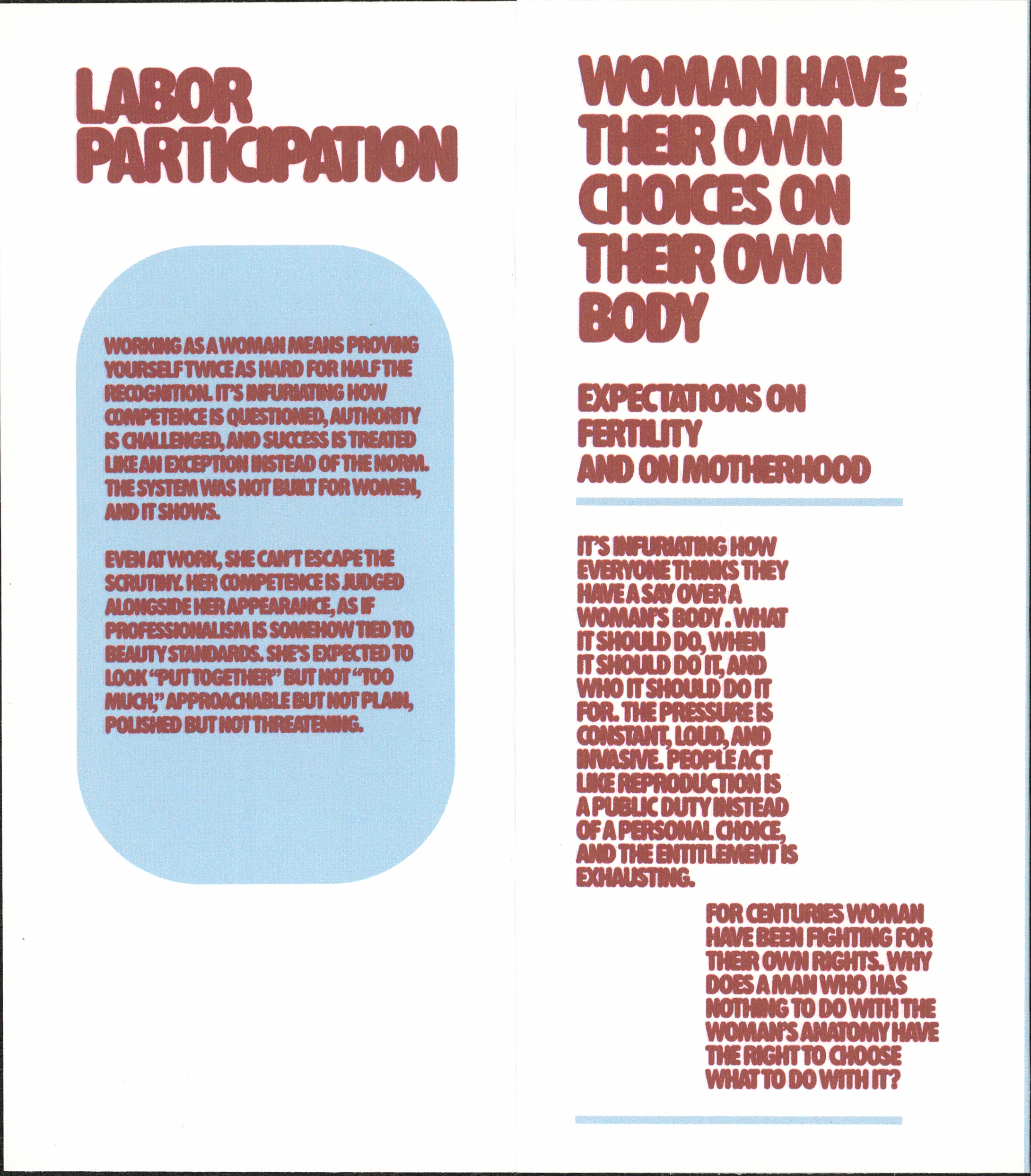
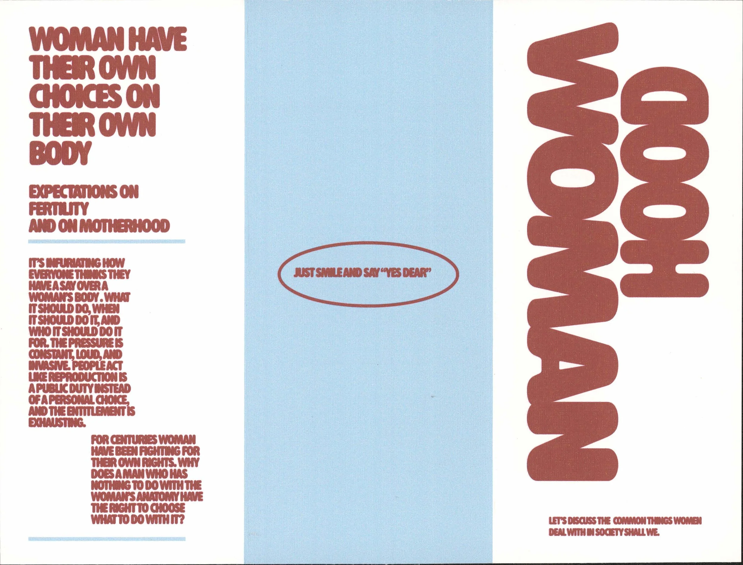
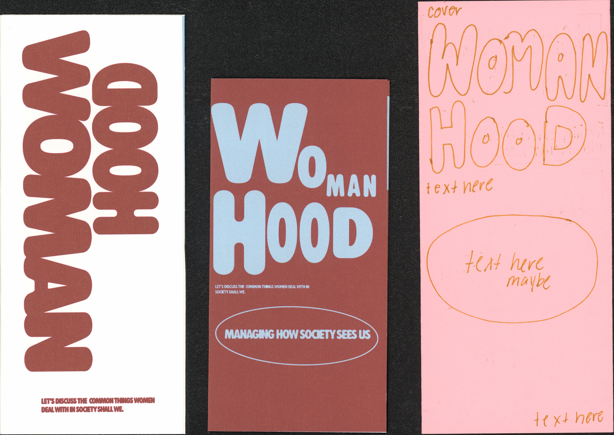
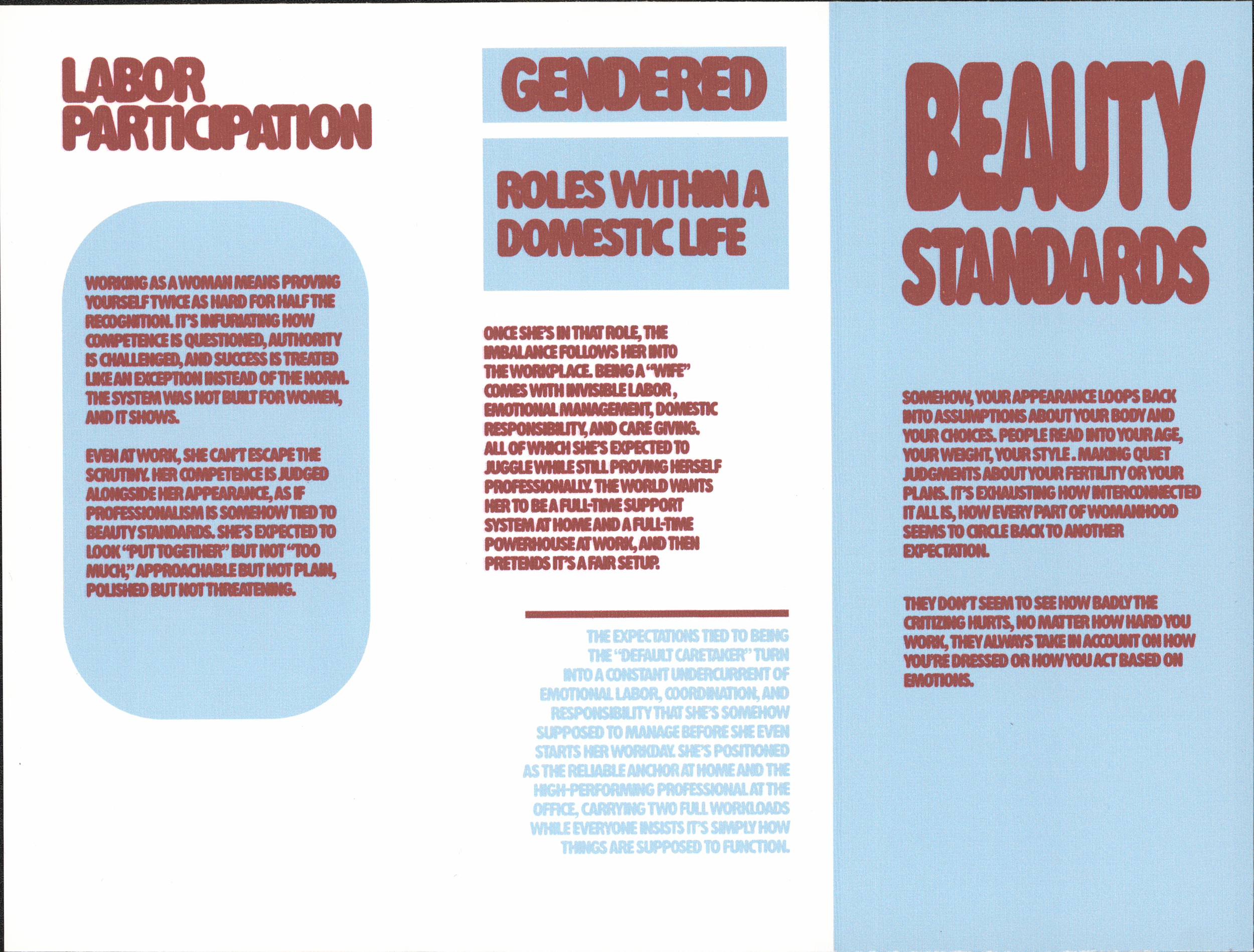
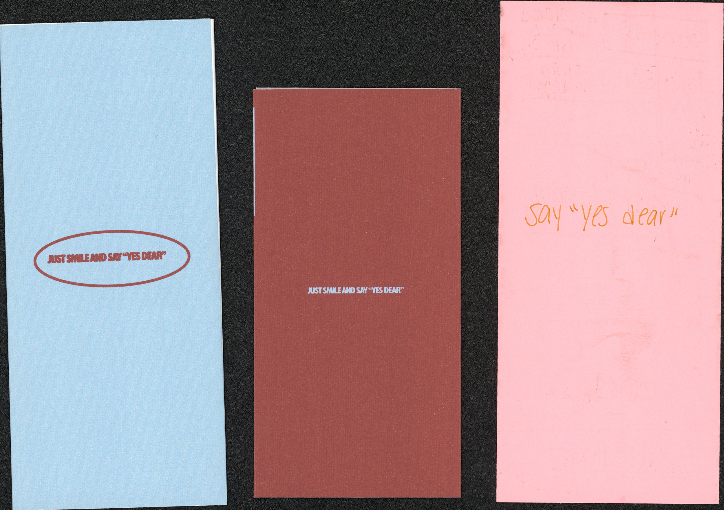
For the second project, we were to make something based on our own interpretation of what a map is. For me, a map is a guide to something, something that is a tool to help you find something or learn something. With that interpretation we could create anything. I choose to do some sort of pamphlet. I wasn’t sure of what at first I just knew I wanted to make a pamphlet since there more often used for educational purposes. When I thought of educational purposes, I decided to make something similar to the pamphlets they give women at the gynecologist for birth control. I didn’t want it to be exactly that but then I went similar to my first route of my theme which was on sterotypes of women in the house. So I went off with explaining how women have been sterotyped/told what to do on these main topics. Their bodies, work, household and beauty standards. Once I got those main topics I decided to make a prototype which was in the pink paper to see how I would go on about design wise.
The pink and red ones are my older drafts. Before I started to fully dive into using InDesign, I made a prototype to help me visualize what I am trying to make. So I made one out of pink printer paper. Then I went to design in the computer. The red was my draft that I showed my teacher in our one-on-one meetings. The white one is my final after getting feedback from my teacher and my classmates. That’s the beauty of receiving criticism; you get to keep improving.
Project 3:
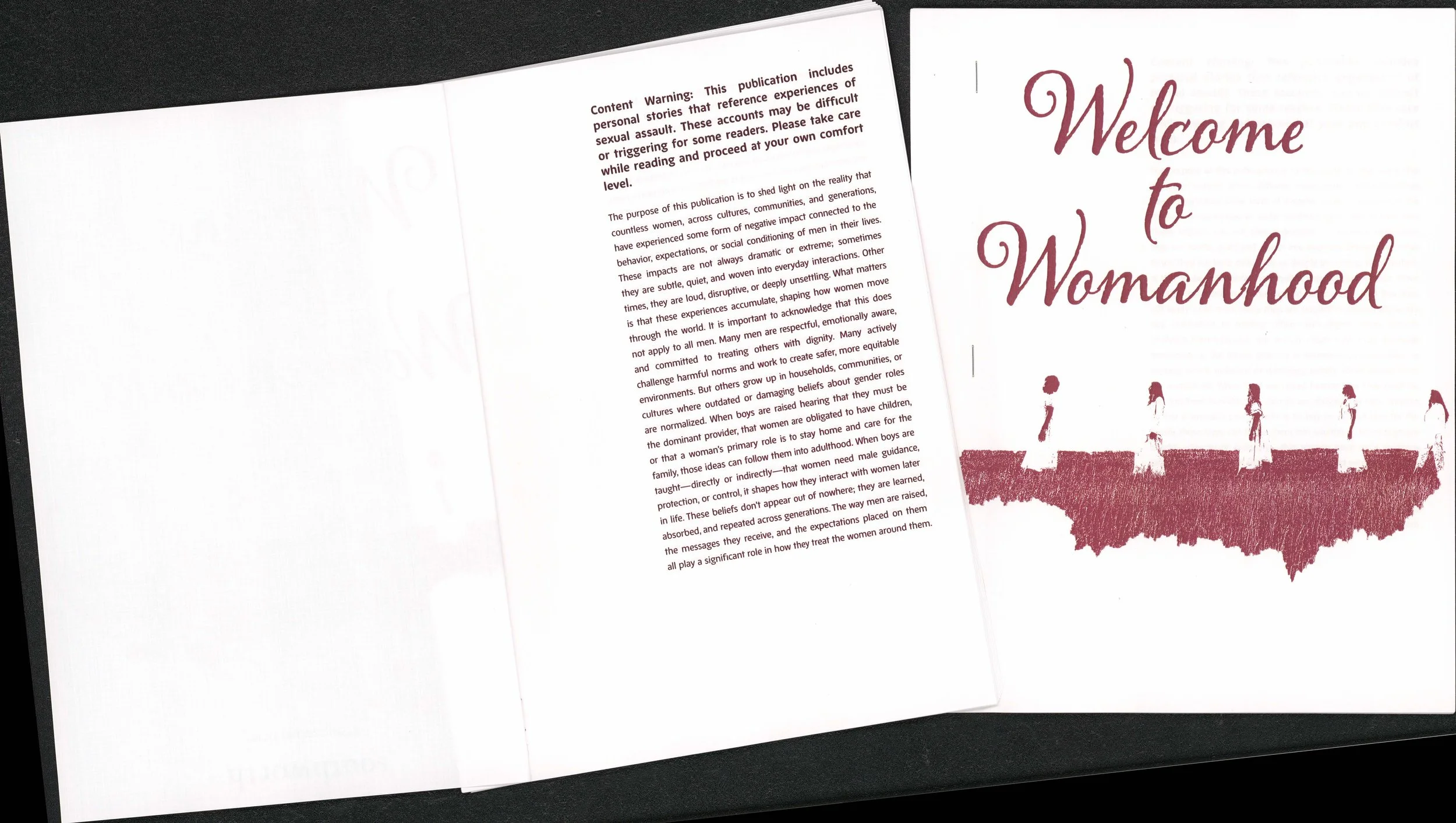
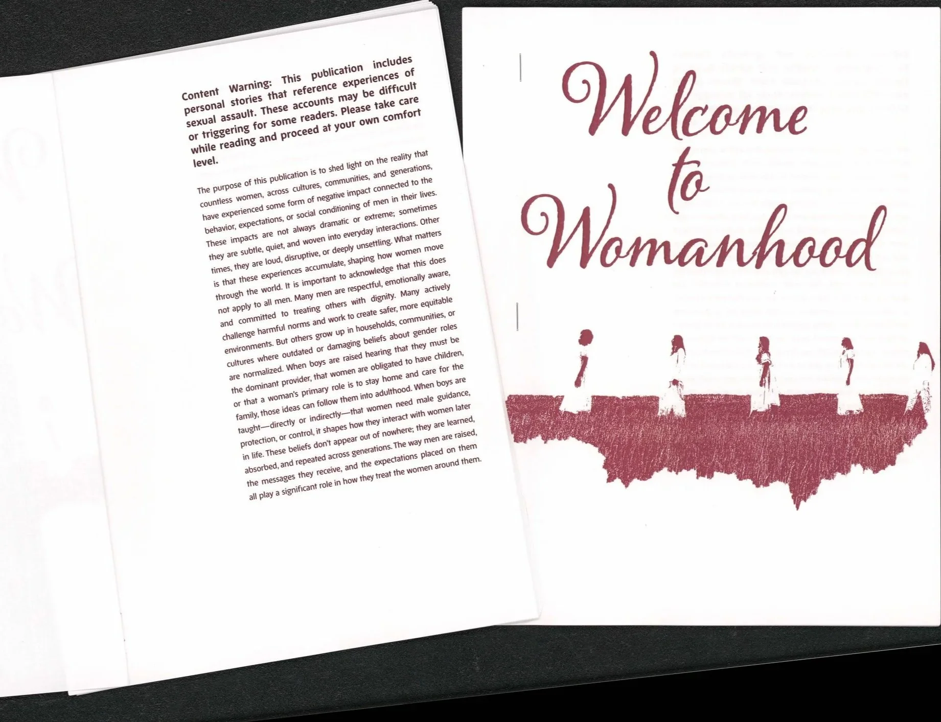
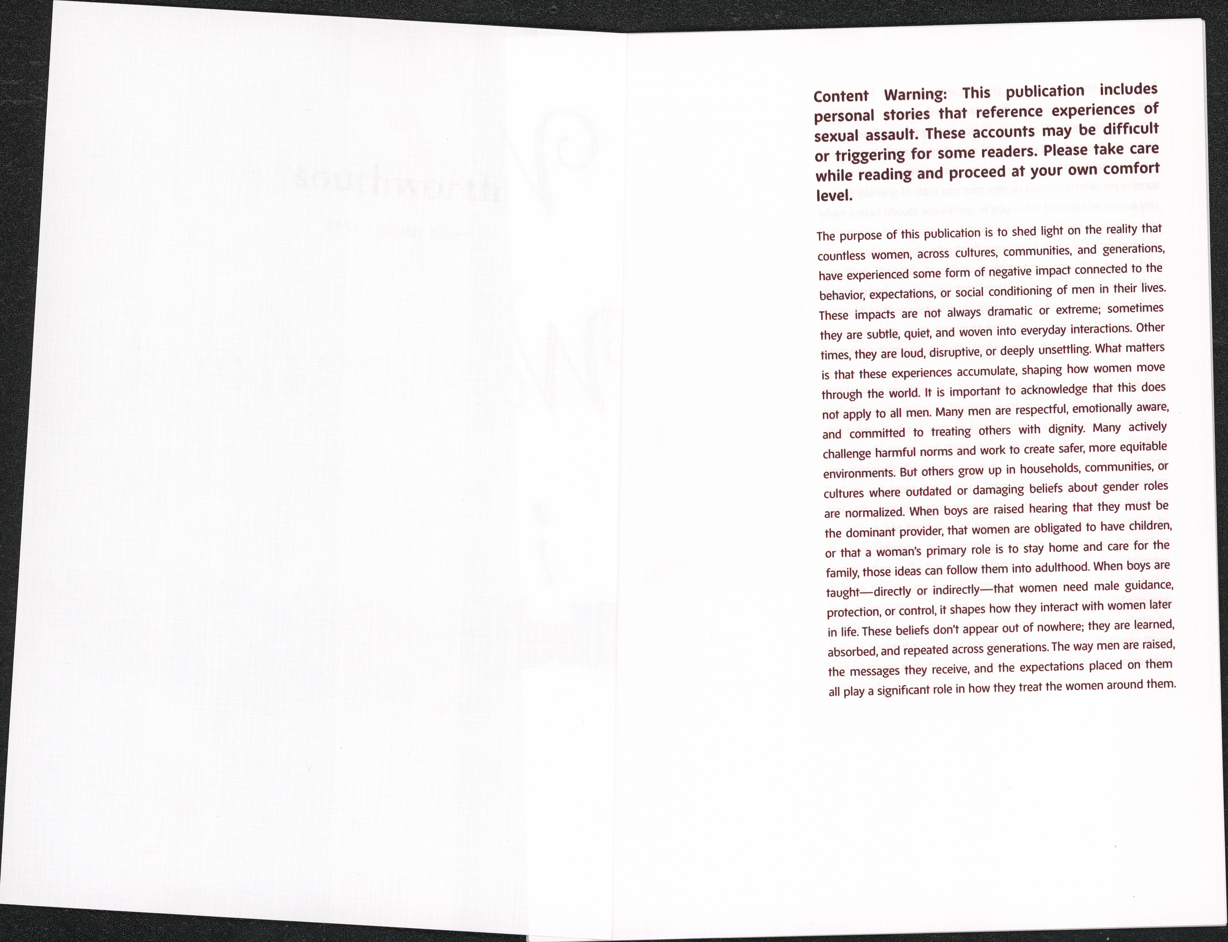
*WARNING: This publication includes personal stories that reference experiences of sexual assault. These accounts may be difficult or triggering for some readers. Please take care while reading and proceed at your own comfort level. *
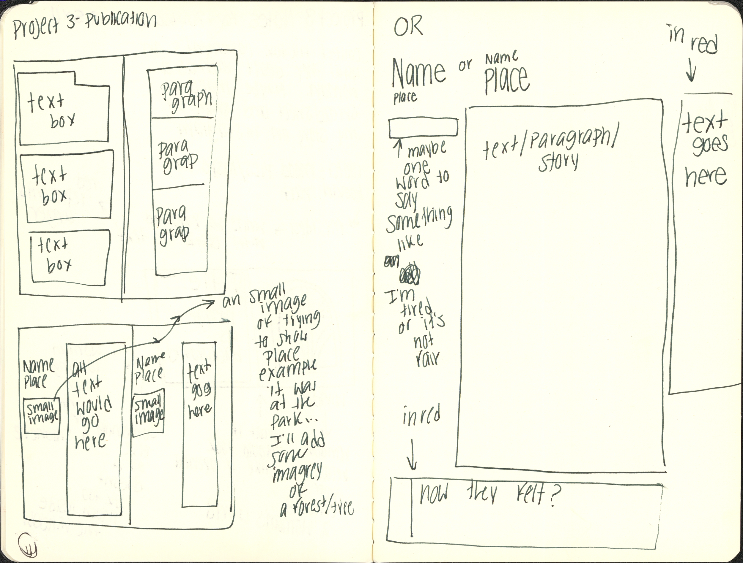
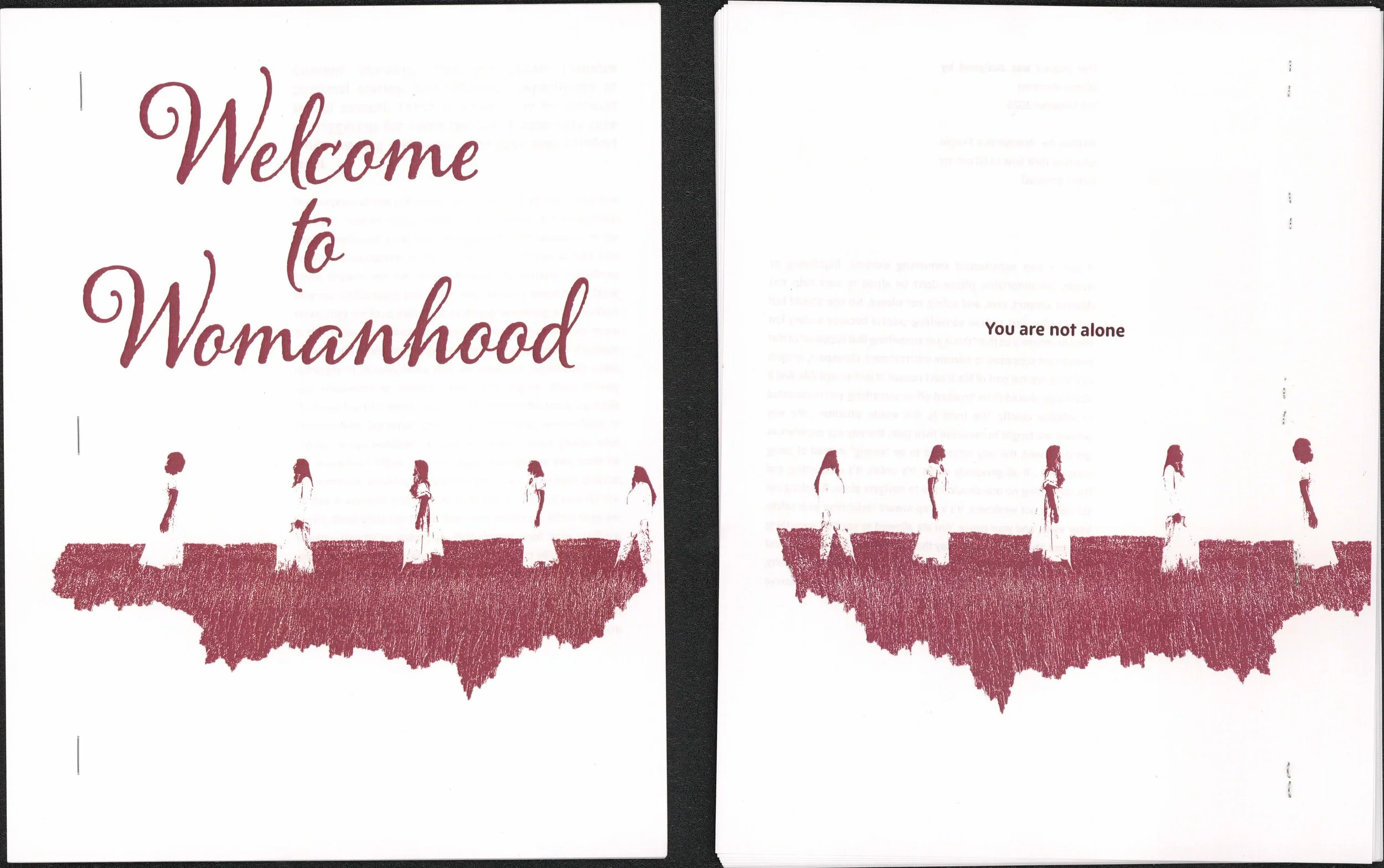
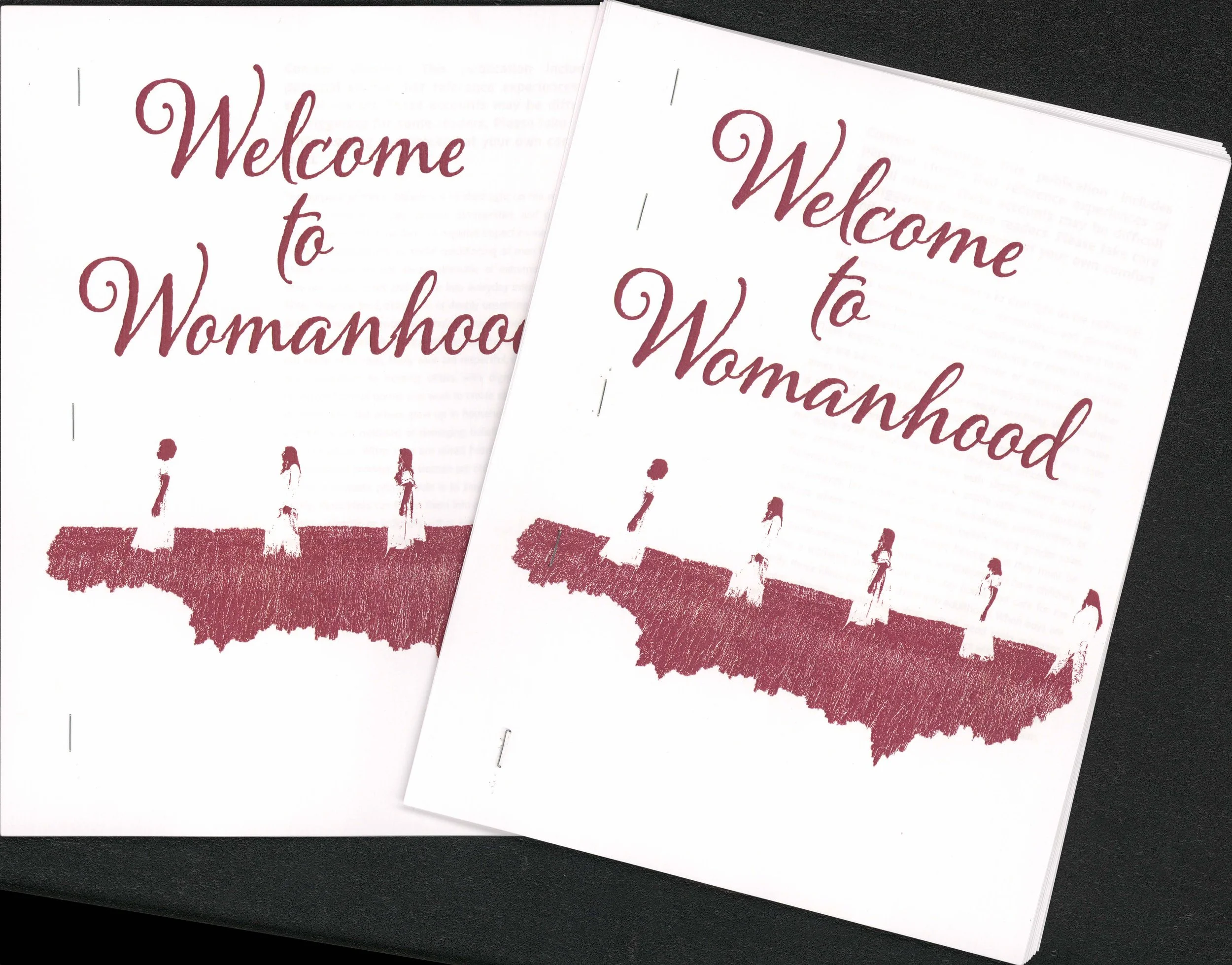
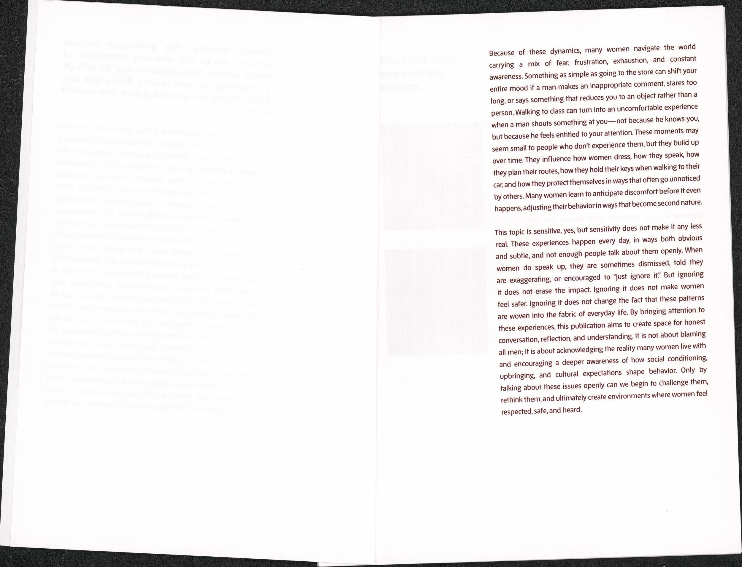
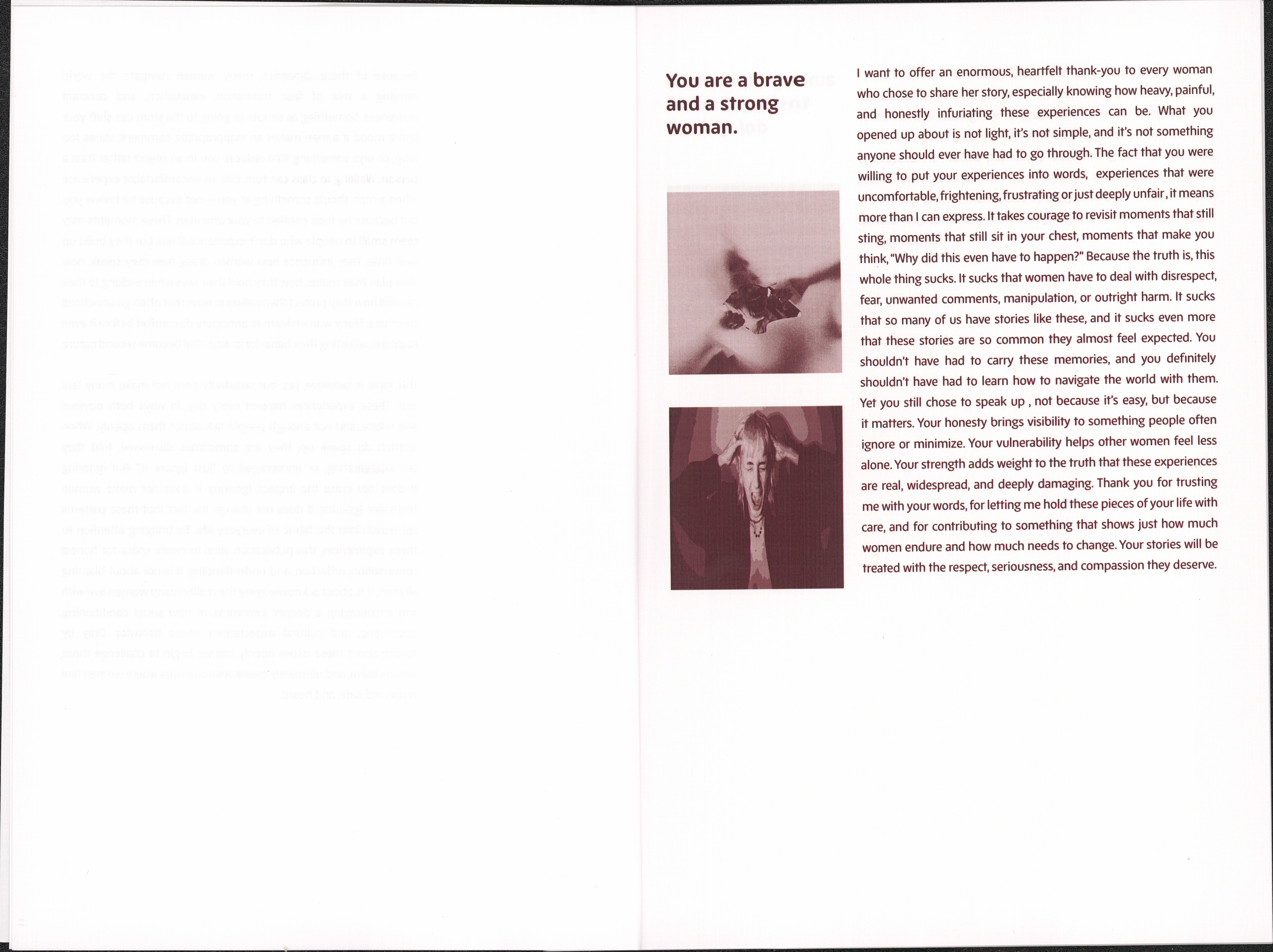
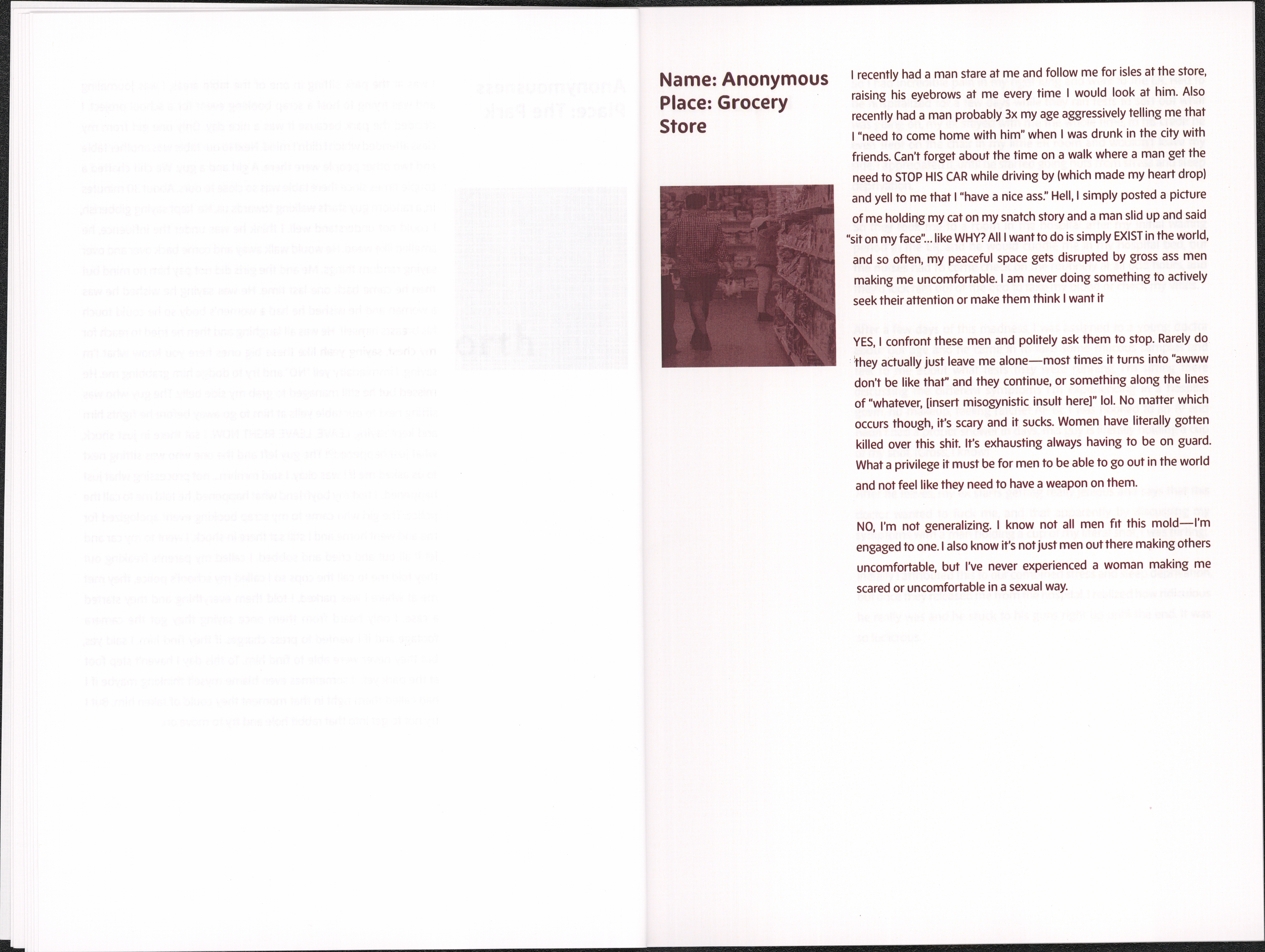
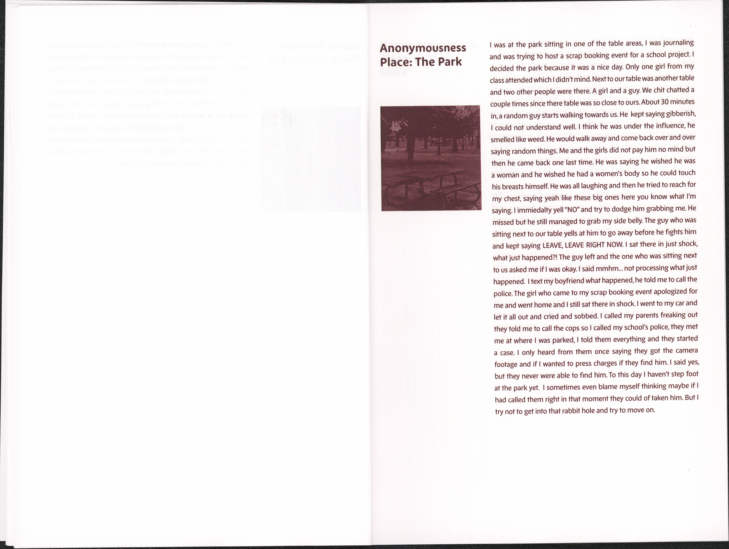
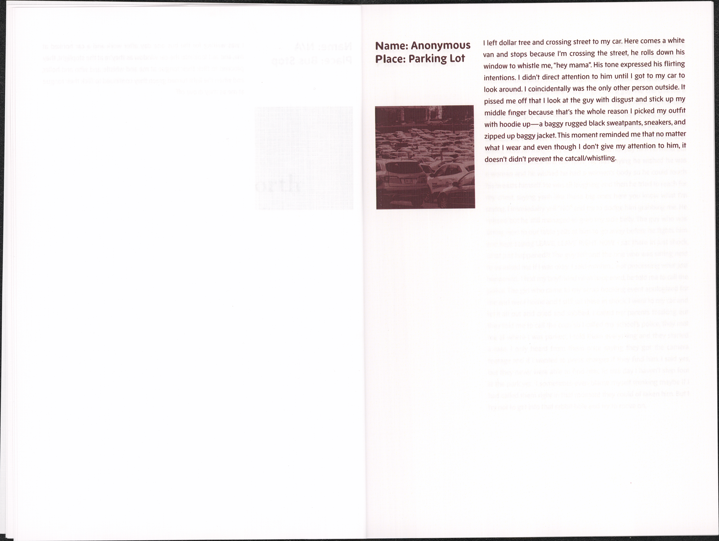
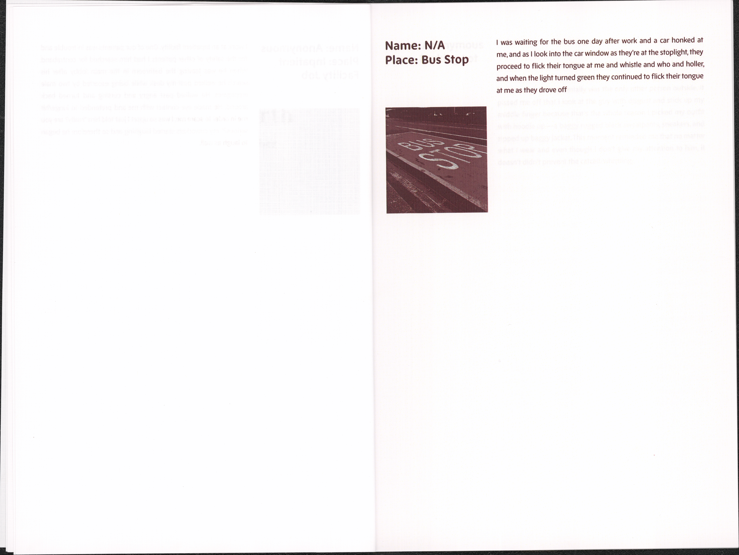
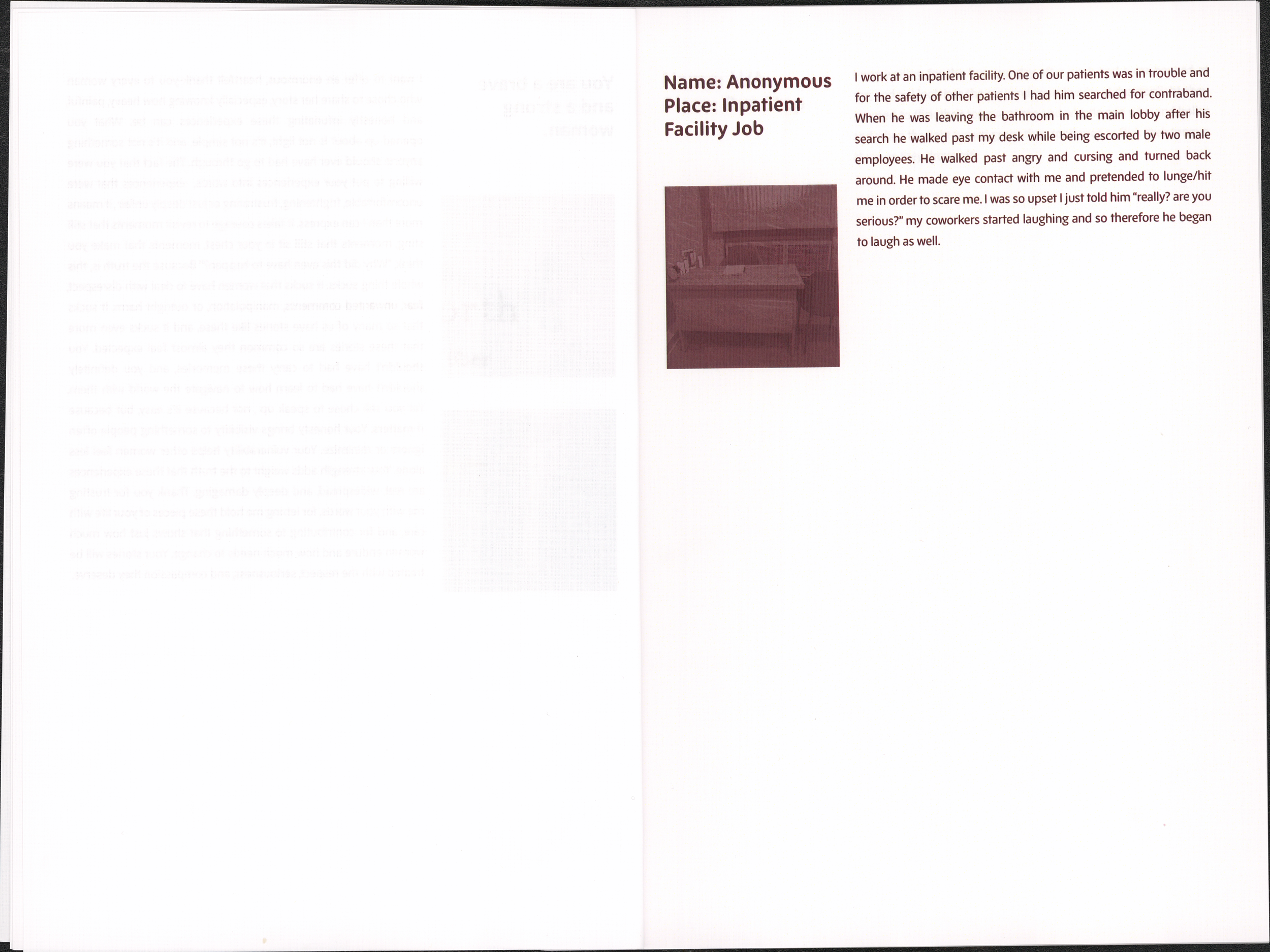
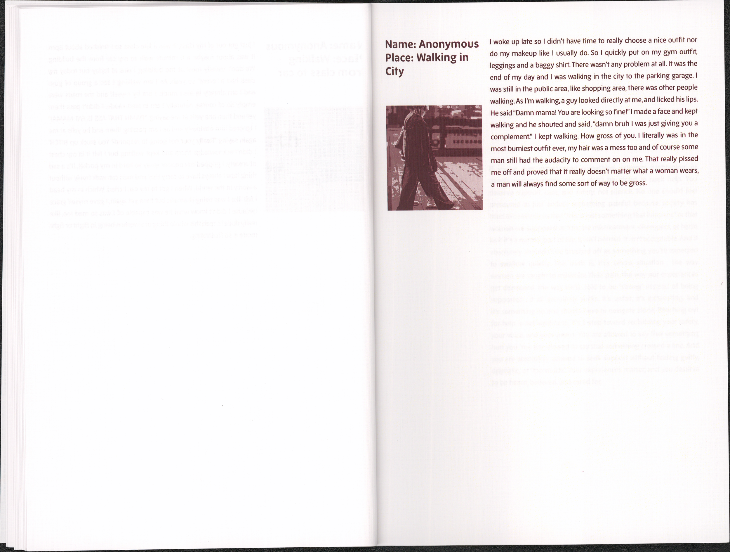
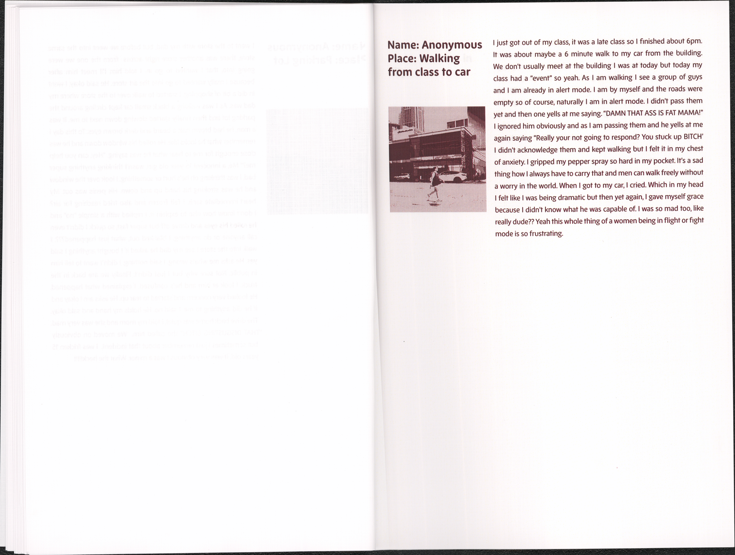
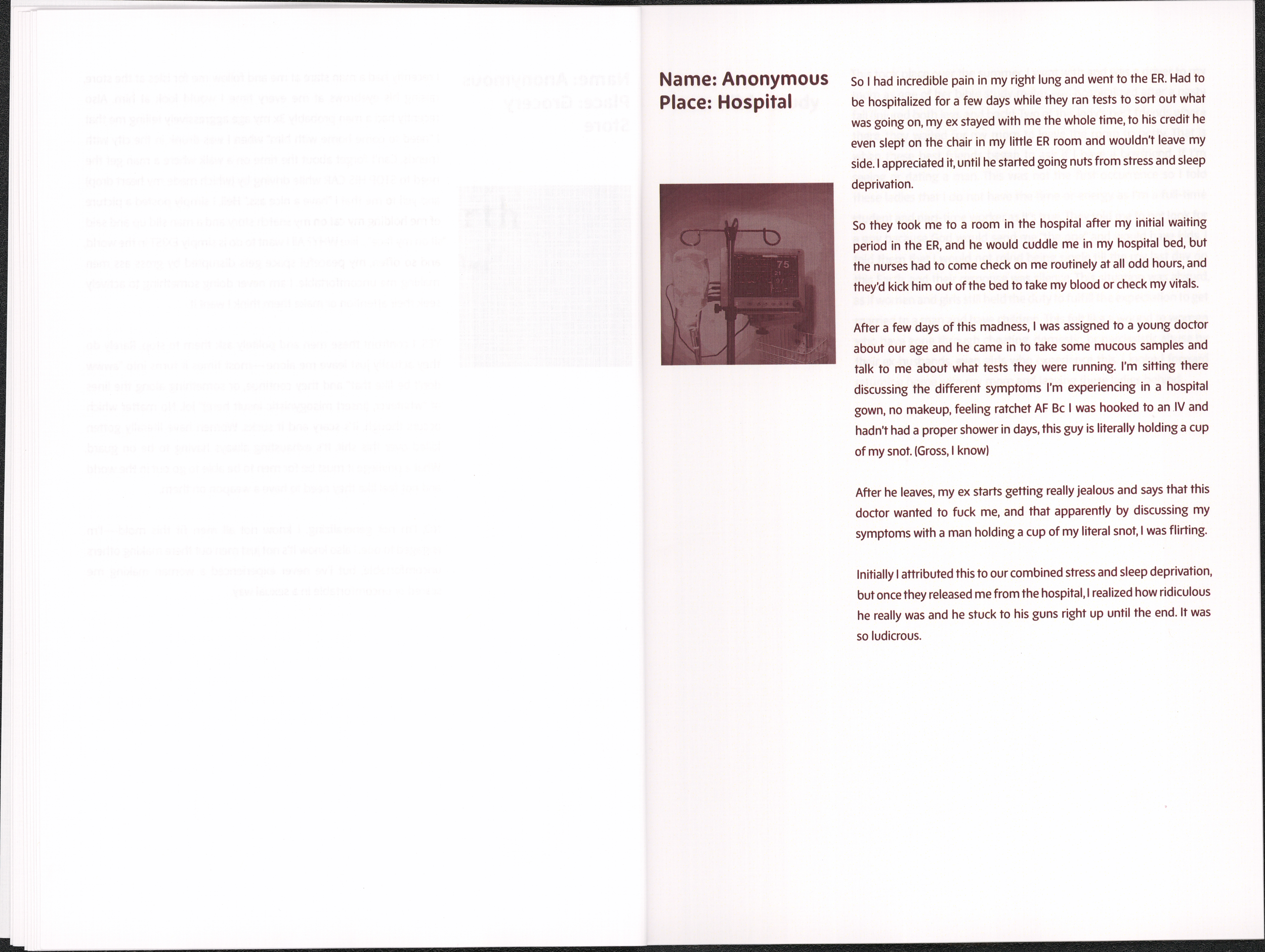
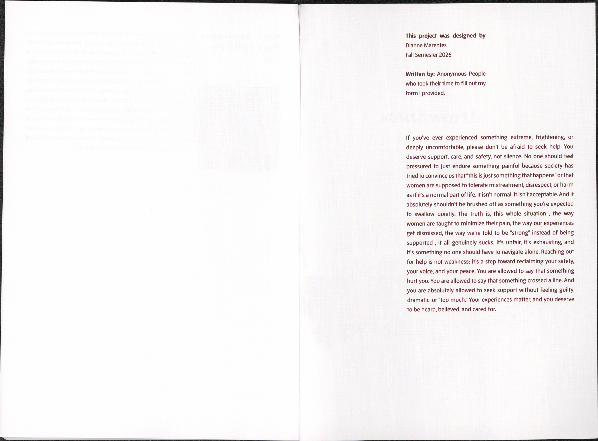
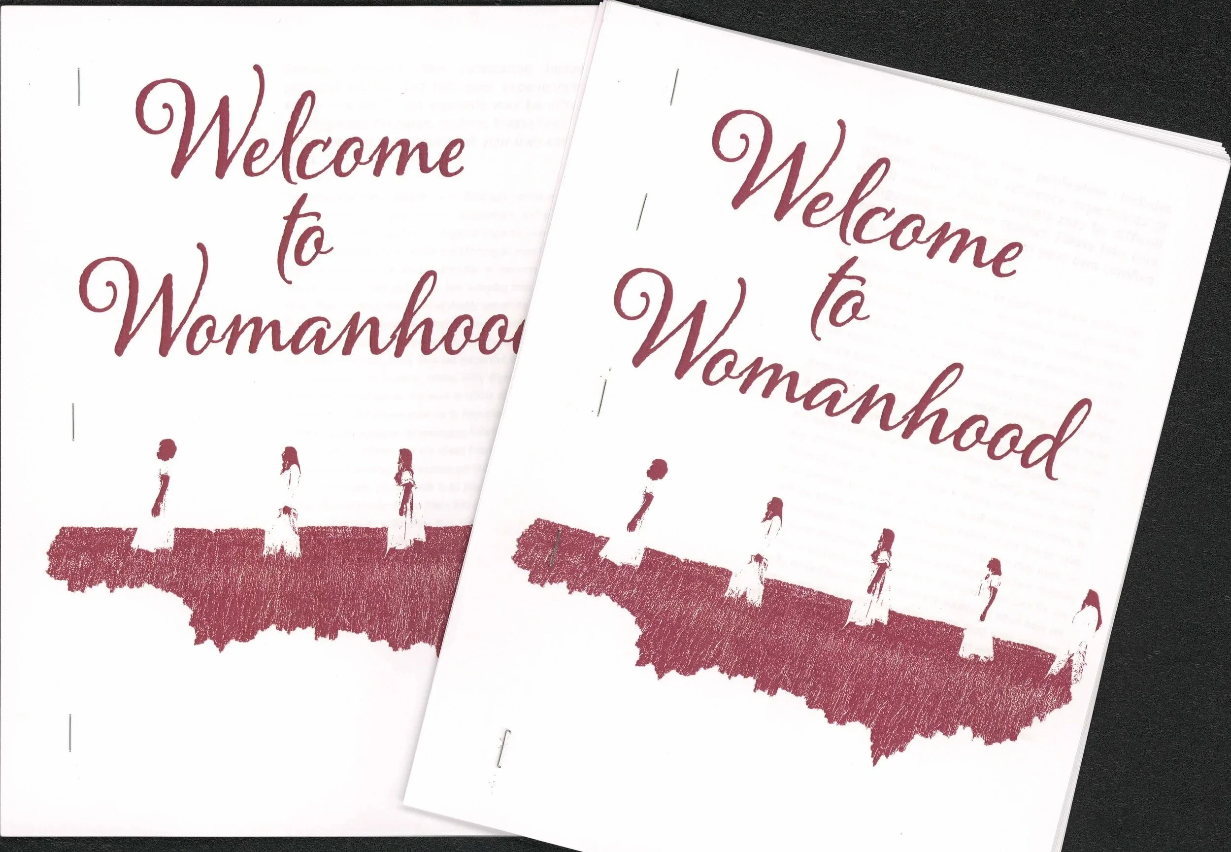
For Project 3, we had to make a book. Minimum of 20 pages. It had to be 8.5×11 and printed on that paper, so the background of the book had to be white because we couldn’t have bleeds for color background. We weren’t allowed to print on bigger paper and trim it down to 8.5×11. The main focus of this book was on structure and organization when it comes to type. The book requirement was 70% type and a small amount of images. It was definitely a challenge for me since my work is always so visual with imagery. I didn’t really have to think about what my book was going to be about since I instantly knew I wanted to do something with women's experiences out in the world when it came to overall just being a woman. So I began with making a form for anyone to fill out and share any personal experiences they have had when it came to gender. Whether it was at work being belittled because ther’re a woman, or being catcalled. Anything. I made sure that this was a safe place for anyone. After gathering responses, I began with laying every page out. I chose red for my type and imagery because I wanted it to resemble period blood, something strong and feminine. Overall, I am very happy with how it came out: a very powerful message that women are strong no matter how harsh the world is.